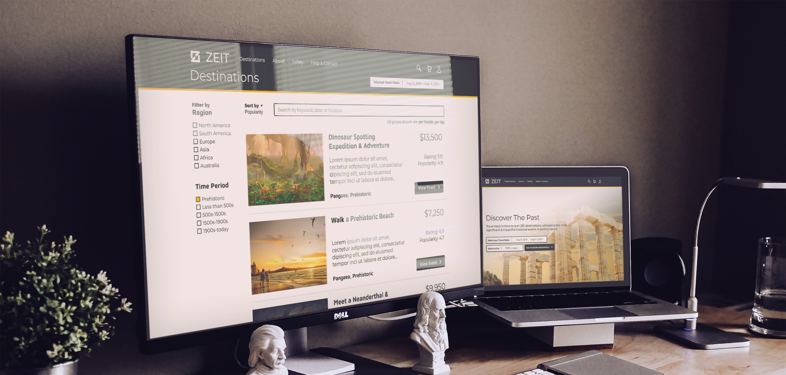
Case Study:

Zeit - a (fictional) travel company,
offering time travel experiences.


Project Overview:

Zeit is in the unique position of being the only travel company in the industry to offer time travel experiences. Although the tech is over a decade old, a recent change in time travel regulations will allow Zeit to offer their services to the general public for the first time. They’ve spent time curating over 280 historic destinations and are ready for travelers to begin booking their trips, discovering the past.


Role: UX Researcher & Designer

Tools: Adobe XD, Illustrator, Photoshop

Time Spent: 120 hours (school project)

Deliverables: Modern logo, responsive website

Team: Design mentor & myself

 
3mockup.png
 

Case Study Process:

1. Research

Market Analysis
Comp Analysis
Primary Research

4. Prototype

Resp. UI Mock-ups
Desktop Prototype

2. Refine

User Personas
Site Structure
Task & User Flows

5. Test

Usability Testing
Affinity Mapping


3. Design

Logo & Branding
UI Wireframes
Visual Design


1. Research


As Zeit is the first company to offer time travel experiences, both primary & secondary research was conducted on indirect competitors and users who have booked non-time travel services in the past.

4 users interviewed to understand their perception of time travel, things they consider important when booking travel, and what types of experiences they would be interested in.

8 competitors reviewed to identify common design patterns & user flows in the travel/booking industry.


Research Goals:

- Understand user time travel expectations
- Identify common design patterns & user flows
- Research travel statistics


Research Methods:

- Competitor Analysis
- Market Research
- User Interviews


Findings


Competitor Analysis:

There were quite a few common design patterns identified across the travel & experience booking industry. For example, the primary CTA (figure 1) included a single destination form field, pre-filled date travel date ranges, and a large, colorful “find” button. More generally, sites included striking photography, highlighted deals/offers, and marketing tied to a company’s rewards program.


User Interview Findings:

The main theme through each interview was that, overall, users felt uncomfortable with the concept of time travel - safety and reliability being a top concern. Outside of safety, up-front pricing, a simple booking flow, and good deals were top decision influencers. Outside of these concerns, users were excited by the prospect of experiencing past cultures and witnessing historical events.

 
plain-white-background.jpg
 

2. Refine


A primary user persona
”Alfred” was born out of an amalgamation of my user interviews. He is a persona who books travel fairly often, though mainly for business.


A site map & structure
created based on user interviews & common patterns identified through the competitor analysis.


Key user flows
are designed based on common patterns and expected user behaviors of our persona “Alfred.”


3. Design


Logo
While conceptualizing the logo, I tried to pattern the mark after the letter “Z” and, semi-illustrate the message of “going back to another timeline.”

Started by sketching on grid-paper, moving into flat design in Illustrator.

Screen Shot 2019-09-08 at 6.46.22 PM.png
 

Wireframes
I started by building basic wireframes for a few of the main pages across the site.

These blocks help give a general feel of the site layout and structure, and are the building blocks for iteration as the site is further fleshed out and the design starts to take shape.


Colors
When reviewing competitor brand colors, nearly all had a green / blue paired with an orange / red.

To stand out, and to give Zeit a more up-scale look, I selected a dark green contrasted by a deep yellow.


Typography
Montserrat keeps a light, modern look for most of the site’s type. Maven Pro is used as the second header & CTA font for its bolder modern vibe, that comes off slightly futuristic.


UI Kit
A clean & tidy interface with buttons, icons, drop-downs, detail cards, etc. that are consistent in look & feel.


Visual Design
Moving into the site’s visual design, the wireframes and UI kit are merged together. The original wireframe structure is maintained, bar a few updates to the event card & home page layouts.

Visually engaging color photography is used across the site to highlight each event or destination, showing an enticing “glimpse” of the past.

 
plain-white-background.jpg
 

4. Prototype


To enable user testing of the three main site flows,
a medium-fidelity, 37 page prototype was built.

Main flows:
Searching for, Saving, & Booking a trip


5. Test

To evaluate the usability of the design, I tested the 3 main user flows with 5 test users.

Each user was observed in-person, as they interacted with the prototype to complete each task. The goal was to ensure user flows and site architecture were easily understood, but also to identify and resolve any major pain points prior to the start of development.

 
Screen Shot 2019-09-14 at 2.00.33 PM.png

Task 1: Locate the Wright brother’s first flight event and complete the booking process.

 
Screen Shot 2019-09-14 at 2.05.26 PM.png

Task 2: Locate the Dinosaur Spotting event and save the trip to your account.

 
Screen Shot 2019-09-14 at 2.07.26 PM.png

Task 3: Sign in, locate your “first saved trip” and complete the booking process.


Results


Strengths

All users completed each scenario without failure, quickly finishing each task / use case. Users shared that the common design patterns made it a easy and straightforward experience, they felt like they always knew what their next steps were.Users liked the branding and overall look / feel of the website: feeling Zeit was modern, friendly, professional, & simple

Opportunities

2/5 Users

Confused by “Start Date” labelling on the hero CTA drop-down. Users weren’t sure if the start date was for the current-day travel date or if it was the date they were traveling to the past.

1/5 Users
Wanted to select travel end date from the start. They felt they missed a step, expecting to select the end date after the start date. Wasn’t expecting to see an end date in checkout.


Zeit Affinity Map.png
 

Iterations

Based on the testing result, the hero CTAs were re-labelled and the action of selecting an End Date was added from the start.

Although adding the end date changes the hero CTA, there were many more downstream impacts such as a now needing to pre-fill the “day’s traveling” checkout form field, and updating the nav treatment when browsing for historical events.

Screen Shot 2019-10-01 at 9.59.05 PM.png
 
plain-white-background.jpg
 

Summary & Hand-off:

As a final step, I took a pass at the design file to ensure consistent font sizing, coloring, & spacing. Preparing a clean file for developer hand-off.


Although Zeit’s time travel offering is the first of its kind, the process of booking a vacation or event is rooted in familiar design patterns used across the travel industry. To address safety concerns, being the main finding in user research, a dedicated “safety” nav placement and prominent landing page section (first section under the hero) were implemented.

During prototype testing, users were able to successfully complete each of the main user flows without issue - which is a compliment to the overall site & user flow designs. Only a few opportunities were identified through testing, specifically regarding the hero CTA labeling and date selection options - changes, of which, were implemented in the final design specs that were prepped for developer hand-off.

Fin.